Potrzebie
Thursday, September 08, 2011
Wroten on the Wind
.
For Alex Jay's blog on creating logos and lettering, go here.
I wrote the article below about the Wroten Lettering studio and its important contribution to EC Comics for Russ Cochran's hardcover reprint of EC's M.D. (1988). Here it is with a few minor changes. Margaret Wroten's quote in the next-to-last paragraph was a surprising revelation, since until then no one had ever mentioned the existence of a Manhattan studio where EC freelancers could do work.
Wroten on the Wind
EC Comics used Leroy lettering by the husband-and-wife team of Jim and Margaret Wroten. On the Al Feldstein-edited titles the artists received pages minus layouts but with the Wrotens’ inked lettering already down on the boards.
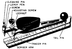
Leroy lettering requires a collection of templates and a small handheld instrument, the scriber. An inked letter is produced by the penholder on one side of the scriber as the metal stylus on the other side follows the grooves in the template positioned an inch below.
 EC’s extensive use of Leroy lettering, one suspects, derives as much from Bill Gaines‘ compulsion for neatness as it did from the reasons he offered in The Comics Journal #81 (May 1983): “My father, when he did Wonder Woman, and I have no idea why, used Leroy lettering… The older Wonder Womans were Leroy lettered by Jimmy Wroten, who started out as a salesman for Keuffel & Esser, who made, among other things, my slide rule. They were the big company for slide rules, for templates, for Leroy lettering. Leroy lettering mostly was used for lettering charts, engineering charts and so on, which it is beautiful for. How the hell it got involved in comics I don’t know, but it suited us very well because Al was a script-oriented person. Although he is an artist, and a pretty good one, when he started writing, he was more interested in the script than the art… Because Al used so many words, we found we could do it more clearly with Leroy lettering. If we had wanted a hand-letterer to work that small, to get all that copy in, it would have been very difficult for him. You’ll notice Kurtzman’s stuff has very light copy. He never liked Leroy lettering; he wanted the feel of the hand-lettering, so we used Ben Oda, a fine Japanese hand-letterer, who still works for DC and occasionally does something for us.”
While scripting directly on the boards used for the finished art, Feldstein penciled in the copy in a system advantageous for Wroten, as Gaines explained: “He would take his six, seven or eight sheets of paper, because we had a formula—it was either an eight, seven or six-page story. He’d take a ruler, rule out the panels, he’d letter right into the panels, he’d hold his lettering three lines down so the letterer could read what he was lettering, because he used Leroy lettering with templates, and he had to leave room for the template.”
Since all Feldstein-edited books, over a period of years, featured Leroy lettering, readers assumed Feldstein chose to use Leroy lettering as the ideal adjunct to his clean, crisp art technique, but in 1975, he told interviewer Ed Spiegel (Fanfare #1, Spring 1977) that this choice was not his preference: “I inherited that. When I joined Bill, they were already using it. I think it was a mistake. Harvey didn’t want any part of Leroy. But the fellow who did it for us, Jim Wroten, had this whole family arrangement, and we didn’t have the heart to take it away from them. Jim and his wife did it. We published all those years with it, and I think it made the books appear a bit static. But there’s another angle to examine, and that’s whether the heavy captions I did would have been harder to read without it. It’s not easy to sustain good lettering over a whole paragraph.”
 Jim and Margaret Wroten’s studio, Wroten Lettering, remained in operation for decades until Jim Wroten’s death in 1980. The couple, who first met in elementary school, grew up together in Baltimore. When I interviewed Margaret Wroten in 1986, she talked about the mid-1930s when Jim’s uncle helped him land a job at Keuffel & Esser in Morristown, New Jersey, leaving her in Baltimore. A year later, in 1937, they married. “Remember, it was the pit of the Depression,” she recalled. “You couldn’t get jobs. I had worked for the gas and electric company when he worked for Keuffel & Esser. I was just a housewife. He had been with them for about 18 months when we were married. Jim was about the best Leroy letterer around. He taught me how to do it. He demonstrated for Keuffel & Esser at different trade shows; that’s how he started doing it.”
He continued as a Keuffel & Esser salesman during World War II, exempt from military service because of his “confidential work for the government,” as she put it. Wroten Lettering began at the end of WWII when the couple, in 1945, joined William Moulton Marston (1893-1947) and others on the Wonder Woman team at 331 Madison Avenue.
“Jim quit Keuffel & Esser when we got our studio; he thought it would be a nice little business for the two of us to do together. Our studio was Doc Marston’s office. We were on the 12th floor. The art studio where Harry G. Peter worked was upstairs, right over us on the 13th floor. They had another artist, a girl named Arlene, who did backgrounds for him. Harry G. Peter was a nice old gentleman; he was just a nice person. We went out to Doc’s home several times, but after Doc died we never kept in touch with the rest of the family. He had an assistant who helped him write stories; her name was Joye Hummel. She married, and I think she’s down in Florida someplace.
 “That’s how we started. We got started doing Wonder Woman, and through that we met Mr. Gaines [Max Gaines] and did work for him—because Doc Marston and Mr. Gaines were good friends. For Mr. Gaines we did Picture Stories from Science, the books on history and the story of The Bible. We worked on all of those.”
Wroten Lettering’s list of clients boomed in the post-WWII years. “We worked on EC Comics. We worked on Hillman Comics. And Victor Fox—we worked on some of his too. We did charts, and we did lettering on some romance magazines at 500 Fifth. At one time we had some help, but mostly it was just my husband and myself. I liked working with him, and I happened to like Leroy lettering. I think it’s a very fine kind of lettering."
In addition to the comic books, the Wrotens also lettered for comic strips—Bert Whitman’s syndicated Debbie Dean (1942-48) and Stan MacGovern’s antic angle on human behavior, Silly Milly (1939-50), which had little syndication but appeared in the featured slot at the top of the New York Post’s comics page. In Sinclair Lewis’ novel Bethel Merriday (1940) a character leaving New York remarks that they won’t miss the city except for Silly Milly. Once toasted in a “Stan MacGovern Night” at Leon & Eddie’s nightclub, the talented MacGovern became one of the more curiously neglected cartoonists of the 20th Century because his popular Silly Milly was never seen nationally. He abandoned cartooning in the 1950s, opened an unsuccessful East Rockaway, Long Island gift shop, and then worked at a Long Island furniture store. He was 72 when he committed suicide in 1975.
With the advent of EC’s New Trend, the Wrotens often worked evenings and weekends to keep pace with the ever-increasing number of words per page. “When we went into the horror comics, heck, the lettering on the horror comics practically took up half the panels. All you were getting was heads, a lot of heads. When we first got into the business, a survey was taken that said the concentration span of a child was very limited—and they said 35 to 40 words a page. Those you could turn out in 15 or 20 minutes. Bill Gaines was paying $2.50 a page. I’d count the words sometimes and find 400 to 500 words on a page. That’s a lot of words. The average way it used to be when comics were first done was with 35, 40 or 50 words a page, and you could do a page in 15 to 25 minutes or half an hour, depending on the words.; 400 to 500 words a page would take an hour or so. When it got so terribly heavy, I think we just reduced the size of the template. We had to go down to a #140 template, I think, because you couldn’t use a #175 with all those words on a page.
“We got it done. We always got it done. We worked night and day on those things. Many nights we stayed until nine o’clock to get something out that they needed the next day. We delivered and picked up our own work. This way we knew it got there; I don’t believe in that messenger stuff. Whenever they would finish the stories, they would give us a call; we would come down, pick up the work, do the lettering and take it back to them when it was done. We tried to proof everything before we sent it down. If Bill found a mistake or made a change, he would mark it off in blue in the margin, and then we would just correct it. Sometimes when there would be changes or he would want to do something else, we would put them on little strips, cut them to fit and put them on with rubber cement.” (This created a problem for reprints many years later when the rubber cement dried, and the tiny strips fell off.)
This exchange of pick-ups and deliveries kept the Wrotens actively involved with EC, since the procedure often necessitated traveling downtown to EC’s office three or four times a week. The Wrotens saw the EC artists not only at the annual EC Christmas parties but also in the course of their work, since the deadline pace occasionally required the artists to go to 331 Madison. “We just had one big room. It was a small office, but it was large enough for three boards. If they didn’t finish something, or if they wanted to make a last-minute correction, they could do that. Once in a while they would stop in and pick up work from us. If they needed to make a correction, we had pens and ink they could use. This didn’t go on all the time. This was just if they wanted to to do something quick or change something. Lots of time they would even bring up the work. Jack Davis used to come in, and Wood came in. We always had an extra drawing board, and they could sit down and do whatever they wanted to do.
“Bill had very good artists. We always got comic books. I had loads and loads of them. I gave them away. I shouldn’t have, should I? The last comic books we did were for EC, and then Jimmy just got out of it. He went into doing charts, badge cards, formulas for chemical houses and floor plans for trade shows all over the country. We sublet part of the studio during the 1960s. I gave up the studio after he passed on six years ago.”
For Alex Jay's blog on creating logos and lettering, go here.
I wrote the article below about the Wroten Lettering studio and its important contribution to EC Comics for Russ Cochran's hardcover reprint of EC's M.D. (1988). Here it is with a few minor changes. Margaret Wroten's quote in the next-to-last paragraph was a surprising revelation, since until then no one had ever mentioned the existence of a Manhattan studio where EC freelancers could do work.
Wroten on the Wind
EC Comics used Leroy lettering by the husband-and-wife team of Jim and Margaret Wroten. On the Al Feldstein-edited titles the artists received pages minus layouts but with the Wrotens’ inked lettering already down on the boards.
Leroy lettering requires a collection of templates and a small handheld instrument, the scriber. An inked letter is produced by the penholder on one side of the scriber as the metal stylus on the other side follows the grooves in the template positioned an inch below.
While scripting directly on the boards used for the finished art, Feldstein penciled in the copy in a system advantageous for Wroten, as Gaines explained: “He would take his six, seven or eight sheets of paper, because we had a formula—it was either an eight, seven or six-page story. He’d take a ruler, rule out the panels, he’d letter right into the panels, he’d hold his lettering three lines down so the letterer could read what he was lettering, because he used Leroy lettering with templates, and he had to leave room for the template.”
Since all Feldstein-edited books, over a period of years, featured Leroy lettering, readers assumed Feldstein chose to use Leroy lettering as the ideal adjunct to his clean, crisp art technique, but in 1975, he told interviewer Ed Spiegel (Fanfare #1, Spring 1977) that this choice was not his preference: “I inherited that. When I joined Bill, they were already using it. I think it was a mistake. Harvey didn’t want any part of Leroy. But the fellow who did it for us, Jim Wroten, had this whole family arrangement, and we didn’t have the heart to take it away from them. Jim and his wife did it. We published all those years with it, and I think it made the books appear a bit static. But there’s another angle to examine, and that’s whether the heavy captions I did would have been harder to read without it. It’s not easy to sustain good lettering over a whole paragraph.”
M.D. #1: Joe Orlando art with Wroten lettering.

He continued as a Keuffel & Esser salesman during World War II, exempt from military service because of his “confidential work for the government,” as she put it. Wroten Lettering began at the end of WWII when the couple, in 1945, joined William Moulton Marston (1893-1947) and others on the Wonder Woman team at 331 Madison Avenue.
“Jim quit Keuffel & Esser when we got our studio; he thought it would be a nice little business for the two of us to do together. Our studio was Doc Marston’s office. We were on the 12th floor. The art studio where Harry G. Peter worked was upstairs, right over us on the 13th floor. They had another artist, a girl named Arlene, who did backgrounds for him. Harry G. Peter was a nice old gentleman; he was just a nice person. We went out to Doc’s home several times, but after Doc died we never kept in touch with the rest of the family. He had an assistant who helped him write stories; her name was Joye Hummel. She married, and I think she’s down in Florida someplace.
Incredible Science Fiction #31: Wally Wood

Wroten Lettering’s list of clients boomed in the post-WWII years. “We worked on EC Comics. We worked on Hillman Comics. And Victor Fox—we worked on some of his too. We did charts, and we did lettering on some romance magazines at 500 Fifth. At one time we had some help, but mostly it was just my husband and myself. I liked working with him, and I happened to like Leroy lettering. I think it’s a very fine kind of lettering."
In addition to the comic books, the Wrotens also lettered for comic strips—Bert Whitman’s syndicated Debbie Dean (1942-48) and Stan MacGovern’s antic angle on human behavior, Silly Milly (1939-50), which had little syndication but appeared in the featured slot at the top of the New York Post’s comics page. In Sinclair Lewis’ novel Bethel Merriday (1940) a character leaving New York remarks that they won’t miss the city except for Silly Milly. Once toasted in a “Stan MacGovern Night” at Leon & Eddie’s nightclub, the talented MacGovern became one of the more curiously neglected cartoonists of the 20th Century because his popular Silly Milly was never seen nationally. He abandoned cartooning in the 1950s, opened an unsuccessful East Rockaway, Long Island gift shop, and then worked at a Long Island furniture store. He was 72 when he committed suicide in 1975.
With the advent of EC’s New Trend, the Wrotens often worked evenings and weekends to keep pace with the ever-increasing number of words per page. “When we went into the horror comics, heck, the lettering on the horror comics practically took up half the panels. All you were getting was heads, a lot of heads. When we first got into the business, a survey was taken that said the concentration span of a child was very limited—and they said 35 to 40 words a page. Those you could turn out in 15 or 20 minutes. Bill Gaines was paying $2.50 a page. I’d count the words sometimes and find 400 to 500 words on a page. That’s a lot of words. The average way it used to be when comics were first done was with 35, 40 or 50 words a page, and you could do a page in 15 to 25 minutes or half an hour, depending on the words.; 400 to 500 words a page would take an hour or so. When it got so terribly heavy, I think we just reduced the size of the template. We had to go down to a #140 template, I think, because you couldn’t use a #175 with all those words on a page.
“We got it done. We always got it done. We worked night and day on those things. Many nights we stayed until nine o’clock to get something out that they needed the next day. We delivered and picked up our own work. This way we knew it got there; I don’t believe in that messenger stuff. Whenever they would finish the stories, they would give us a call; we would come down, pick up the work, do the lettering and take it back to them when it was done. We tried to proof everything before we sent it down. If Bill found a mistake or made a change, he would mark it off in blue in the margin, and then we would just correct it. Sometimes when there would be changes or he would want to do something else, we would put them on little strips, cut them to fit and put them on with rubber cement.” (This created a problem for reprints many years later when the rubber cement dried, and the tiny strips fell off.)
This exchange of pick-ups and deliveries kept the Wrotens actively involved with EC, since the procedure often necessitated traveling downtown to EC’s office three or four times a week. The Wrotens saw the EC artists not only at the annual EC Christmas parties but also in the course of their work, since the deadline pace occasionally required the artists to go to 331 Madison. “We just had one big room. It was a small office, but it was large enough for three boards. If they didn’t finish something, or if they wanted to make a last-minute correction, they could do that. Once in a while they would stop in and pick up work from us. If they needed to make a correction, we had pens and ink they could use. This didn’t go on all the time. This was just if they wanted to to do something quick or change something. Lots of time they would even bring up the work. Jack Davis used to come in, and Wood came in. We always had an extra drawing board, and they could sit down and do whatever they wanted to do.
“Bill had very good artists. We always got comic books. I had loads and loads of them. I gave them away. I shouldn’t have, should I? The last comic books we did were for EC, and then Jimmy just got out of it. He went into doing charts, badge cards, formulas for chemical houses and floor plans for trade shows all over the country. We sublet part of the studio during the 1960s. I gave up the studio after he passed on six years ago.”
Labels: ec, feldstein, gaines, joe orlando, wroten
¶ 10:49 AM 3 comments
Wednesday, January 26, 2011
I was so much Elder (1921-2008) then; I'm younger than that now. #2

Kickstarter: Chicken Fat


Kickstarter: Chicken Fat


Labels: elder, gaines, hajdu, kurtzman, trump
¶ 8:07 AM 0 comments
Thursday, December 23, 2010
Wood Chips 24: Sunset on Mars
.
 Click "Wood Chips 24" heading at top to hear Ray Bradbury's "Mars Is Heaven" on X Minus One (1955). EC's adaptation was in Weird Science 18 (March-April, 1953). Following the Wood panels while listening offers a textbook example of specific differences in adapting a short story for radio and comics. Wood's research into period architecture is seen throughout amid lush vegetation, and he also drew what he knew; between 1937 and 1940, he lived in four different small towns in Wisconsin.
Drawing Green Lake, Wisconsin (a real place), he filled the interiors with such Victoriana as a roll-top desk and a shelf for displaying dishes. Surely Bradbury must have been delighted the first time he saw Wood's interpretation of his story. But note the curious window on page five which has four panes on the bottom sash and six on the top sash (which fills two-thirds of the window frame). This is similar to Wood's "There Will Come Soft Rains" error of the automobile preventing the automatic garage door from opening and closing.


H.B Vestal was the first illustrator of "Mars Is Heaven" in Planet Stories (Fall 1948).
 1890s Queen Anne style Victorian homes in Wisconsin. (Top two images are the same building from different angles.)


To read the entire Wally Wood "Spawn of Mars" story, go to Cloud 109. It was published in EC's Weird Fantasy 9 (September-October, 1951).
 To read the entire 3D "Spawn of Venus" story. go to Golden Age Comic Book Stories. It was created for an unpublished EC 3-D title (1954), but it was never published by EC.
In 1968, to get the original art for the Nostalgia Press EC reprint book, I went with Bill Gaines and Jerry DeFuccio to the real vault of horror, a midtown storage facility where Gaines kept the art for each of his comic books in large individual manila envelopes. I remember this as a large, dimly lit room with a concrete floor and locked storage rooms somewhat like small trailers. These had to be pulled out and unlocked. It was necessary to set up a work light on a stand inside the storage trailer so Jerry DeFuccio could locate each envelope. Gaines pulled a story from each envelope and handed the envelope back to Jerry. Then I stacked each story on a nearby table.
Earlier, when I told Wood I was going to Gaines' vault, he asked me to retrieve his 3-D sf story, "The Spawn of Venus", so he could use it in witzend. That was the first time Wood had seen the artwork in 15 years, and he then published it in witzend 6 (1969).

To see all of the "Spawn of Venus" pencil pages, go to stwallskull.

To read the entire Al Feldstein "Spawn of Venus", go to Entre Comics. It was originally in Weird Science 6 (March-April, 1951).


Drawing Green Lake, Wisconsin (a real place), he filled the interiors with such Victoriana as a roll-top desk and a shelf for displaying dishes. Surely Bradbury must have been delighted the first time he saw Wood's interpretation of his story. But note the curious window on page five which has four panes on the bottom sash and six on the top sash (which fills two-thirds of the window frame). This is similar to Wood's "There Will Come Soft Rains" error of the automobile preventing the automatic garage door from opening and closing.
©copyright 2010 by WMG estate and Ray Bradbury


H.B Vestal was the first illustrator of "Mars Is Heaven" in Planet Stories (Fall 1948).


To read the entire Wally Wood "Spawn of Mars" story, go to Cloud 109. It was published in EC's Weird Fantasy 9 (September-October, 1951).

In 1968, to get the original art for the Nostalgia Press EC reprint book, I went with Bill Gaines and Jerry DeFuccio to the real vault of horror, a midtown storage facility where Gaines kept the art for each of his comic books in large individual manila envelopes. I remember this as a large, dimly lit room with a concrete floor and locked storage rooms somewhat like small trailers. These had to be pulled out and unlocked. It was necessary to set up a work light on a stand inside the storage trailer so Jerry DeFuccio could locate each envelope. Gaines pulled a story from each envelope and handed the envelope back to Jerry. Then I stacked each story on a nearby table.
Earlier, when I told Wood I was going to Gaines' vault, he asked me to retrieve his 3-D sf story, "The Spawn of Venus", so he could use it in witzend. That was the first time Wood had seen the artwork in 15 years, and he then published it in witzend 6 (1969).
©copyright 2010 by WMG estate and Bill Pearson

To see all of the "Spawn of Venus" pencil pages, go to stwallskull.

To read the entire Al Feldstein "Spawn of Venus", go to Entre Comics. It was originally in Weird Science 6 (March-April, 1951).

Above images ©copyright 2010 by WMG estate.
Labels: bradbury, defuccio, feldstein, gaines, mars, pearson, stwallskull, witzend, wood chips
¶ 3:05 PM 2 comments
Sunday, September 26, 2010
Four Color Fear
 It seems unfortunate to me that cartoonist Howard Nostrand (1929-1984) was not a contributor to the early Mad comic book. He would have been a comfortable fit, more so than John Severin.
Below is Nostrand's strange, surreal "What's Happening at... 8:30 P.M." from Witches Tales #25 (June 1954). This has just been reprinted in Greg Sadowski and John Benson's noirish, nightmarish Four Color Fear, an anthology of pre-Code 1950s terror tales, coincidentally shipping during Banned Books Week (September 25 to October 2).
When I interviewed Nostrand in 1968, I carried along a copy of Witches Tales #25. I asked him about Harvey Comics, Bob Powell and this story: "Harvey had a sort of chicken attitude about horror stuff. Like it should be horrible but not too horrible. Granted, they get a little ghastly every once in a while, but I suppose they wanted to keep it in fairly good taste. When you look at '8:30 P.M', there's nothing particularly horrible about it. It's a little germ wandering around. And the fact that the germ gets killed, nobody's going to lie awake at night thinking about it."

He also spoke about the Eisner-like title billboard in the splash and achieving atmospherics on the first page: "Powell was a great fan of Hitchcock's, same way that Eisner was. You look at an old Hitchcock movie... the first thing you do is set the scene. This is what I tried to do in a lot of these things. You set a mood for the whole thing. With about the first three shots, you set the mood, and then you go from there... Eisner used to get his titles in the opening panel there. The treatment is strictly Eisner. But then again, the background and all that is EC." Nostrand also commented on the unusual coloring: "It's supposed to be on the inside of a body, and so everything is kind of reddish. The only thing that isn't red is this foreign body."

This analogy between the interior of a city and a human body, linked only by redness, is what makes this story remarkable, actually more imaginative than such movies as Fantastic Voyage (1966) and Innerspace (1987). As I wrote years ago, it has more in common with Samuel Beckett's journey into self-perception, Film (1965), shot in lower Manhattan with a dying Buster Keaton. You can see Film here.
Strange synchronicity when I wrote about this story in the early 1980s for The Comics Journal: I wanted to compare it with Film and wished I had a copy of the obscure book about the Beckett movie published years earlier by Evergreen Books. I shlepped up the hill toward the usual Saturday afternoon yard sale. There was a table with only about 20 books. One of them was the very book I needed. Stunned, I gave someone 35 cents for the book, walked back down the hill and continued typing.


I feel lucky Four Color Fear: Forgotten Horror Comics of the 1950s (Fantagraphics, distributed by W.W. Norton) made it here. One side of the W.W. Norton cardboard mailer was ripped open with the book poking out. The mailer was too big, causing the unwrapped book to slide around inside. Someone at the Post Office put it in a plastic bag, and it was delivered hanging on the mailbox where it stayed overnight. You would think a company like W.W. Norton would have figured out how to package books for mailing by now.
Greg Sadowski and John Benson did a superb job on this collection of early 1950s horror stories, including Wood's "The Thing from the Sea" from Eerie #2 (August-September 1951) and Joe Kubert's beautifully drawn "Cat's Death" from Strange Terrors #7 (March 1963). Also included: Fred Kida, Everett Raymond Kinstler, Basil Wolverton, Al Williamson, Frank Frazetta, George Evans, Sid Check, Jack Cole, Bob Powell and others. There's a spectacular section of 32 front covers, full bleed on slick paper, including covers by Wood, Frazetta, Lee Elias and Norm Saunders.
 In addition to Greg's attractive design throughout, he delivers meticulous, pixel-perfect restorations, quite evident to me when I compared the reprint of "What's Happening at... 8:30 P.M." with the original comic book. In the pages above, scanned directly from the book, one can see Greg's patience and precision in creating flawless restorations. It can also be quite time consuming, as I recall from 1988-89 when I did restoration work on ten volumes of NBM's Wash Tubbs and Captain Easy book series.
There are 25 pages of fascinating, informative notes by both Greg and John. I love that line "Comic Media... featured a rising sales chart as its logo". The book has an interactive aspect as one turns back and forth from stories and covers to the notes. The "Cover Section Key" shows the influence of web design, as each note about a cover is accompanied by a full-color thumbnail of the cover.
In an attempt to nail down which issues are "true horror comics", John Benson lists 1,371 pre-Code issues representing 110 titles from 30 companies. He also contributes a full article analyzing the work of scripter-editor Ruth Roche, noting, "Many 1950s horror comics featured violence, gore and menace for their own sake, but in Roche's world they were often only suggested, for they were merely manifestations of her real subject: the unbridled evil and chaos that was always lurking just beneath the surface, waiting to escape into the world. The innocent died with the guilty in her stories, and sometimes the particular personification of evil would still be at large at the story's end. A chilling variation on the theme of hidden chaos is the discovery that a loved one or trusted figure is actually 'the other' (a theme effectively used in the movie Invasion of the Body Snatchers a few years later). 'Evil Intruder' tellingly develops this theme and is one of the more horrifying stories in the whole genre." The slobbering love-starved creature in this outré story (from Journey into Fear #12) is totally unlike anything one might see in fantasy films or TV.
 I don't like to read an article reversed into black, but even so, the inside front cover, title pages, contents page and intro, unified by the black background surrounding colorful typographic devices, all demonstrate Greg's skill as an inventive designer.
The only real flaw is the Adam Grano cover design. I always disliked the idea of enlarging panels to show halftone dots. Maybe this was clever 40 years ago, but now it's just annoying. Greg could have easily designed a much better cover, possibly by combining his logo-like title page creation with the Frank Frazetta/Sid Check cover of Beware #10 (July 1954), showing the undead about to toss a gravity-defying girl into an open grave.
This book is like time-traveling, a document of an era. Some of these stories and covers I barely recall, some are familiar and others are new to me. This will stand as an important reference work that should be shelved alongside David Hajdu's The Ten-Cent Plague. Where Hajdu detailed the behind-the-scenes political machinations and wild witchhunts of the 1950s anti-comics crusade, Four Color Fear shows what was actually available on newsstands at the time.

One minor error: The 1931-38 horror-fantasy radio series which inspired Gaines was The Witch's Tale, not The Old Witch's Tale. The host-narrator of the series was not the Old Witch, but Old Nancy, the Witch of Salem. Miriam Wolfe, who died in 2000, was 13 years old when she began portraying the cackling Old Nancy. The program's creator, Alonzo Deen Cole, provided the meows of Old Nancy's coal black cat Satan. To hear The Witch's Tale, go here.
For PDF preview of Four Color Fear with four complete stories, go here.

Below is Nostrand's strange, surreal "What's Happening at... 8:30 P.M." from Witches Tales #25 (June 1954). This has just been reprinted in Greg Sadowski and John Benson's noirish, nightmarish Four Color Fear, an anthology of pre-Code 1950s terror tales, coincidentally shipping during Banned Books Week (September 25 to October 2).
When I interviewed Nostrand in 1968, I carried along a copy of Witches Tales #25. I asked him about Harvey Comics, Bob Powell and this story: "Harvey had a sort of chicken attitude about horror stuff. Like it should be horrible but not too horrible. Granted, they get a little ghastly every once in a while, but I suppose they wanted to keep it in fairly good taste. When you look at '8:30 P.M', there's nothing particularly horrible about it. It's a little germ wandering around. And the fact that the germ gets killed, nobody's going to lie awake at night thinking about it."

He also spoke about the Eisner-like title billboard in the splash and achieving atmospherics on the first page: "Powell was a great fan of Hitchcock's, same way that Eisner was. You look at an old Hitchcock movie... the first thing you do is set the scene. This is what I tried to do in a lot of these things. You set a mood for the whole thing. With about the first three shots, you set the mood, and then you go from there... Eisner used to get his titles in the opening panel there. The treatment is strictly Eisner. But then again, the background and all that is EC." Nostrand also commented on the unusual coloring: "It's supposed to be on the inside of a body, and so everything is kind of reddish. The only thing that isn't red is this foreign body."

This analogy between the interior of a city and a human body, linked only by redness, is what makes this story remarkable, actually more imaginative than such movies as Fantastic Voyage (1966) and Innerspace (1987). As I wrote years ago, it has more in common with Samuel Beckett's journey into self-perception, Film (1965), shot in lower Manhattan with a dying Buster Keaton. You can see Film here.
Strange synchronicity when I wrote about this story in the early 1980s for The Comics Journal: I wanted to compare it with Film and wished I had a copy of the obscure book about the Beckett movie published years earlier by Evergreen Books. I shlepped up the hill toward the usual Saturday afternoon yard sale. There was a table with only about 20 books. One of them was the very book I needed. Stunned, I gave someone 35 cents for the book, walked back down the hill and continued typing.


The stories in Four Color Fear are public domain, but the
specific restored images and design are ©2010 Fantagraphics Books.
specific restored images and design are ©2010 Fantagraphics Books.
I feel lucky Four Color Fear: Forgotten Horror Comics of the 1950s (Fantagraphics, distributed by W.W. Norton) made it here. One side of the W.W. Norton cardboard mailer was ripped open with the book poking out. The mailer was too big, causing the unwrapped book to slide around inside. Someone at the Post Office put it in a plastic bag, and it was delivered hanging on the mailbox where it stayed overnight. You would think a company like W.W. Norton would have figured out how to package books for mailing by now.
Greg Sadowski and John Benson did a superb job on this collection of early 1950s horror stories, including Wood's "The Thing from the Sea" from Eerie #2 (August-September 1951) and Joe Kubert's beautifully drawn "Cat's Death" from Strange Terrors #7 (March 1963). Also included: Fred Kida, Everett Raymond Kinstler, Basil Wolverton, Al Williamson, Frank Frazetta, George Evans, Sid Check, Jack Cole, Bob Powell and others. There's a spectacular section of 32 front covers, full bleed on slick paper, including covers by Wood, Frazetta, Lee Elias and Norm Saunders.

There are 25 pages of fascinating, informative notes by both Greg and John. I love that line "Comic Media... featured a rising sales chart as its logo". The book has an interactive aspect as one turns back and forth from stories and covers to the notes. The "Cover Section Key" shows the influence of web design, as each note about a cover is accompanied by a full-color thumbnail of the cover.
In an attempt to nail down which issues are "true horror comics", John Benson lists 1,371 pre-Code issues representing 110 titles from 30 companies. He also contributes a full article analyzing the work of scripter-editor Ruth Roche, noting, "Many 1950s horror comics featured violence, gore and menace for their own sake, but in Roche's world they were often only suggested, for they were merely manifestations of her real subject: the unbridled evil and chaos that was always lurking just beneath the surface, waiting to escape into the world. The innocent died with the guilty in her stories, and sometimes the particular personification of evil would still be at large at the story's end. A chilling variation on the theme of hidden chaos is the discovery that a loved one or trusted figure is actually 'the other' (a theme effectively used in the movie Invasion of the Body Snatchers a few years later). 'Evil Intruder' tellingly develops this theme and is one of the more horrifying stories in the whole genre." The slobbering love-starved creature in this outré story (from Journey into Fear #12) is totally unlike anything one might see in fantasy films or TV.

The only real flaw is the Adam Grano cover design. I always disliked the idea of enlarging panels to show halftone dots. Maybe this was clever 40 years ago, but now it's just annoying. Greg could have easily designed a much better cover, possibly by combining his logo-like title page creation with the Frank Frazetta/Sid Check cover of Beware #10 (July 1954), showing the undead about to toss a gravity-defying girl into an open grave.
This book is like time-traveling, a document of an era. Some of these stories and covers I barely recall, some are familiar and others are new to me. This will stand as an important reference work that should be shelved alongside David Hajdu's The Ten-Cent Plague. Where Hajdu detailed the behind-the-scenes political machinations and wild witchhunts of the 1950s anti-comics crusade, Four Color Fear shows what was actually available on newsstands at the time.

One minor error: The 1931-38 horror-fantasy radio series which inspired Gaines was The Witch's Tale, not The Old Witch's Tale. The host-narrator of the series was not the Old Witch, but Old Nancy, the Witch of Salem. Miriam Wolfe, who died in 2000, was 13 years old when she began portraying the cackling Old Nancy. The program's creator, Alonzo Deen Cole, provided the meows of Old Nancy's coal black cat Satan. To hear The Witch's Tale, go here.
For PDF preview of Four Color Fear with four complete stories, go here.
Labels: beckett, benson, eisner, gaines, hajdu, kurtzman, mad, nostrand, sadowski, severin, wolfe
¶ 4:33 PM 4 comments
Sunday, December 21, 2008
EC Comics: From Here to Nudity #2


The story "A Rottin' Trick!", illustrated by Joe Orlando, was published in EC's Tales from the Crypt 29 (April-May 1952). When the story was reprinted in hardcover in 1979, the larger page size and b/w reproduction on quality paper revealed the artwork in greater detail than was evident in the original comic books on newsprint.
Some noticed unusual human figures cavorting in the fabric design on the drapery in the background of page three. Covered by murky. dark purple ink in the original comic book, these drawings went unseen by both editors and readers in 1952. Given the censorship climate of the 1950s, the discovery then of this single panel could have been devastating for EC publisher Bill Gaines.
Eventually, during the 1980s, someone brought the page to the attention of Gaines, who sent a photocopy to Orlando and demanded an explanation. Orlando responded by writing a letter to Gaines about the artwork on February 29, 1988. The closing sentence about "your brother Rex" is a joke, a reference to a funny hoax Gaines pulled in the 1950s, when he had the Mad office boy convinced that he had an identical twin brother, the evil Rex Gaines, who sometimes visited the Mad office.
This was not the only time a prank was slipped into an EC story. In Frontline Combat 4, the story "Bomb Run," illustrated by John Severin and Bill Elder, has an unusual last panel. It shows a copy of Homer's Odyssey, but the drama of the story is diminished because words from the familiar Ajax Cleanser singing commercial were lettered onto the page of the open book by prankster Elder: "Ajax the foaming cleanser Buh Buh Buh Buh Buh Soaps the dirt right down the drain". Perhaps he assumed that the lettering would reduce and become illegible or that it would be deleted before publication. (The full lyrics went something like this: "Use Ajax (boom boom), the foaming cleanser... (boom bub boom buh boom boom boom) soaps the dirt right down the drain... you'll stop paying the elbow tax when you start cleaning with Ajax! So remember... use Ajax, the foaming cleanser, soaps the dirt right down the drain. bub-bub-bub-bub-bub-bub-boom!") In this case, after EC received a stack of letters from puzzled readers, they apologized in Frontline Combat 6 for their "clumsy oversight".
For the earlier installment on this subject, describing some of the EC art pranks which did not get published, click here.


.


The story "A Rottin' Trick!", illustrated by Joe Orlando, was published in EC's Tales from the Crypt 29 (April-May 1952). When the story was reprinted in hardcover in 1979, the larger page size and b/w reproduction on quality paper revealed the artwork in greater detail than was evident in the original comic books on newsprint.
©2008 WMG
Some noticed unusual human figures cavorting in the fabric design on the drapery in the background of page three. Covered by murky. dark purple ink in the original comic book, these drawings went unseen by both editors and readers in 1952. Given the censorship climate of the 1950s, the discovery then of this single panel could have been devastating for EC publisher Bill Gaines.
Eventually, during the 1980s, someone brought the page to the attention of Gaines, who sent a photocopy to Orlando and demanded an explanation. Orlando responded by writing a letter to Gaines about the artwork on February 29, 1988. The closing sentence about "your brother Rex" is a joke, a reference to a funny hoax Gaines pulled in the 1950s, when he had the Mad office boy convinced that he had an identical twin brother, the evil Rex Gaines, who sometimes visited the Mad office.
This was not the only time a prank was slipped into an EC story. In Frontline Combat 4, the story "Bomb Run," illustrated by John Severin and Bill Elder, has an unusual last panel. It shows a copy of Homer's Odyssey, but the drama of the story is diminished because words from the familiar Ajax Cleanser singing commercial were lettered onto the page of the open book by prankster Elder: "Ajax the foaming cleanser Buh Buh Buh Buh Buh Soaps the dirt right down the drain". Perhaps he assumed that the lettering would reduce and become illegible or that it would be deleted before publication. (The full lyrics went something like this: "Use Ajax (boom boom), the foaming cleanser... (boom bub boom buh boom boom boom) soaps the dirt right down the drain... you'll stop paying the elbow tax when you start cleaning with Ajax! So remember... use Ajax, the foaming cleanser, soaps the dirt right down the drain. bub-bub-bub-bub-bub-bub-boom!") In this case, after EC received a stack of letters from puzzled readers, they apologized in Frontline Combat 6 for their "clumsy oversight".
For the earlier installment on this subject, describing some of the EC art pranks which did not get published, click here.


Labels: ajax, crypt, dc comics, ec, elder, frontline combat, gaines, joe orlando, nudity, prank, severin
¶ 6:15 PM 2 comments
Tuesday, August 12, 2008
The Rhythmic Bestiality of Frank Frazetta
Control click heading to hear Buck Rogers radio program.


 Considering that Frazetta drew for more than half a dozen different comic book publishers during the early 1950s, why so little for EC? He visited the EC offices in late 1951, but then also immediately began his 1952-53 syndicated Johnny Comet (later Ace McCoy) strip. When that vanished from newspapers he penciled a small batch of Flash Gordon dailies (February 1953) before beginning his lengthy tenure on Al Capp’s Li’l Abner.
 But the various 1953-54 editorial crusades, accusing comic books of excessive violence, had already brought repercussions. The editor who deemed the Buck Rogers combat-with-clubs as too violent for Famous Funnies was Stephen A. Douglas (1907-67), a pioneer editor in the field. Between 1934 and 1956 Douglas edited Famous Funnies and several dozen other Eastern Color titles, while also scripting for such characters as Rainbow Boy, Man O’ Metal and Music Master. Had Douglas chosen to go with Frazetta’s drawing, it would have turned up on Famous Funnies #217. Other Famous Funnies Publications with Frazetta covers and stories were Buster Crabbe, Personal Love, Movie Love and Heroic Comics.
When Gaines decided to put this art on Weird Science-Fantasy #29, he requested two minor changes, and these were done by Frazetta with small paste-over patches on the illustration, adding hair to the foreground figure and deleting Buck’s helmet. Frazetta also prepared a silverprint colorguide, but coloring by Marie Severin was used instead.
When the original art was returned later to Frazetta, he removed the paste-over. In EC Portfolio Two (1972), Russ Cochran published (in two different Frazetta colored versions) the Buck Rogers art as first conceived by Frazetta.
This article originally appeared in Weird Science-Fantasy, Vol. 1, published by Russ Cochran in (1982), and it is reprinted here with minor changes. ©2008 Bhob Stewart
©Frank Frazetta


Ranking the Frank Frazetta illustration on Weird Science-Fantasy #29 as “the most outstanding cover ever put on a comic book,” Russ Cochran, in 1972, wrote, “It epitomizes science fiction and adventure, good over evil, light over darkness—modern man battling his bestiality. It is powerful in concept, in design and in execution. The figures are very finely drawn and inked, but there is much more to the illustration than that. Look at the positions and suggested movements in the arms, legs, clubs; even every muscle is contributing to the overall rhythm of the illustration. To me, the rhythm and design (always a characteristic of Frazetta’s work) are even more powerful than the beautifully drawn figures.”
In addition to this cover and Frazetta’s unsigned contributions (inking and occasional complete panels) to Al Williamson pages, the slim output of Frazetta artwork for EC Comics consists of only one other cover—Weird Fantasy #21, with Williamson—plus a handful of stories. Later, during the 1960s, he joined the list of Mad contributors with such pages as the Blechh Shampoo ad (Mad #90) and “Early One Morning in the Jungle” (Mad #106).
In addition to this cover and Frazetta’s unsigned contributions (inking and occasional complete panels) to Al Williamson pages, the slim output of Frazetta artwork for EC Comics consists of only one other cover—Weird Fantasy #21, with Williamson—plus a handful of stories. Later, during the 1960s, he joined the list of Mad contributors with such pages as the Blechh Shampoo ad (Mad #90) and “Early One Morning in the Jungle” (Mad #106).
 Considering that Frazetta drew for more than half a dozen different comic book publishers during the early 1950s, why so little for EC? He visited the EC offices in late 1951, but then also immediately began his 1952-53 syndicated Johnny Comet (later Ace McCoy) strip. When that vanished from newspapers he penciled a small batch of Flash Gordon dailies (February 1953) before beginning his lengthy tenure on Al Capp’s Li’l Abner.
 Former Mad editor Nick Meglin once recalled, “Frank had already started working with Capp, so he didn’t figure prominently in the fading EC scene, allowing them first print rights on a Famous Funnies cover of Buck Rogers which Fritz doctored up for Gaines and was allowed to keep the artwork after printing—the first and only time I know of that Gaines printed something he didn’t actually own. But Frank wanted to cover used, not sold, and that was that.”
A curious karma hung over Bill Gaines’ purchase of this illustration since it had been rejected by Famous Funnies—and Famous Funnies was the comic book displayed on newsstands in 1934 by his father, Max Charles Gaines, thereby launching the comic book industry. “That’s the only piece of art I used in my life that I didn’t buy outright,” Gaines told interviewer Rich Hauser in 1969. “As I recall, I was paying 60 bucks for a cover in those days. I think I offered him 40 bucks for the rights or 60 bucks for the cover outright, and Frank, well, he was never one for the buck. He’d rather have the art. He kept it, and I think I paid $40 or $50. Beautiful work”
A 1954 twilight in Boston. Another day’s session on Li’l Abner came to a close, and the studio drawing tables were vacated. Everyone was gone except for Frazetta, who stayed late that night to do the ninth in his series of Buck Rogers covers for Famous Funnies (#209-216). Surrounded by Moonbeam McSwine, Tiny Yokum, Nightmare Alice and the other Dogpatch denizens, Frazetta completed the picture in one sitting.
A curious karma hung over Bill Gaines’ purchase of this illustration since it had been rejected by Famous Funnies—and Famous Funnies was the comic book displayed on newsstands in 1934 by his father, Max Charles Gaines, thereby launching the comic book industry. “That’s the only piece of art I used in my life that I didn’t buy outright,” Gaines told interviewer Rich Hauser in 1969. “As I recall, I was paying 60 bucks for a cover in those days. I think I offered him 40 bucks for the rights or 60 bucks for the cover outright, and Frank, well, he was never one for the buck. He’d rather have the art. He kept it, and I think I paid $40 or $50. Beautiful work”
A 1954 twilight in Boston. Another day’s session on Li’l Abner came to a close, and the studio drawing tables were vacated. Everyone was gone except for Frazetta, who stayed late that night to do the ninth in his series of Buck Rogers covers for Famous Funnies (#209-216). Surrounded by Moonbeam McSwine, Tiny Yokum, Nightmare Alice and the other Dogpatch denizens, Frazetta completed the picture in one sitting.
 But the various 1953-54 editorial crusades, accusing comic books of excessive violence, had already brought repercussions. The editor who deemed the Buck Rogers combat-with-clubs as too violent for Famous Funnies was Stephen A. Douglas (1907-67), a pioneer editor in the field. Between 1934 and 1956 Douglas edited Famous Funnies and several dozen other Eastern Color titles, while also scripting for such characters as Rainbow Boy, Man O’ Metal and Music Master. Had Douglas chosen to go with Frazetta’s drawing, it would have turned up on Famous Funnies #217. Other Famous Funnies Publications with Frazetta covers and stories were Buster Crabbe, Personal Love, Movie Love and Heroic Comics.
When Gaines decided to put this art on Weird Science-Fantasy #29, he requested two minor changes, and these were done by Frazetta with small paste-over patches on the illustration, adding hair to the foreground figure and deleting Buck’s helmet. Frazetta also prepared a silverprint colorguide, but coloring by Marie Severin was used instead.
When the original art was returned later to Frazetta, he removed the paste-over. In EC Portfolio Two (1972), Russ Cochran published (in two different Frazetta colored versions) the Buck Rogers art as first conceived by Frazetta.
This article originally appeared in Weird Science-Fantasy, Vol. 1, published by Russ Cochran in (1982), and it is reprinted here with minor changes. ©2008 Bhob Stewart
Labels: buck rogers, capp, cochran, ec, frazetta, gaines, nick meglin
¶ 9:52 AM 3 comments
Sunday, March 09, 2008
Funny Face
 .
.
At the EC offices during the early 1950s, Bill Gaines and Harvey Kurtzman look over a completed story.
One influence on Harvey Kurtzman was the Yiddish entertainer Aaron Lebedeff (1873-1960), who was born in Gomel, Belarus, and immigrated to America via Shanghai in 1920. A star of the Yiddish theater and a comedic lyricist, he was still performing in the 1950s. In Mad #4 (April-May 1953), the name of the character Lamont Shadowskeedeeboomboom in Kurtzman's parody of The Shadow is directly inspired by a Lebedeff riff. Control-click on title above to hear a fragment of Lebedeff singing "A Yiddish Leidele."
 The article below in which Harvey Kurtzman explains the origin of Alfred E. Neuman was syndicated to newspapers February 6, 1975. He mentions Bernard Shir-Cliff who later became a contributor to Mad and Help! He did his own humor anthology, The Wild Reader (1956), before moving on as an agent and the editor of Warner Books. For more extensive research into the "What, Me Worry?" kid, see Maria Reidelbach's Completely Mad (Little, Brown, 1991).
Another of Kurtzman's inventions was the hand with six fingers. He drew this in an ersatz engraving style which added to the illusion. It must have been effective, because he was disappointed that no Mad readers commented on the extra finger.
That Face on Mad
by Harvey Kurtzman

There’s a question that nags wherever I go. Again and again I am asked, Where did Alfred Neuman come from? For those of you who didn’t hear a bell ring at the mention of Alfred N., he is the face you see on the covers of Mad magazine. And for those of you who ring, let me put the eternal question to rest, once and for all.

The face first came to my attention when I was doing the comic book Mad for publisher William Gaines in the middle fifties -- I think it was 1954. We were working with Ballantine paperback books on the first of a series of Mad reprint collections.
Since I was Mad’s chief cook and bottle washer at the time, there wasn’t a moment of my waking life that wasn’t devoted to the search for more and more Mad material. In this condition, and while passing the time of day in the office of an editor, Bernard Shir-Cliff, I noticed on the Ballantine Book bulletin board a postcard with this face. The card had some ad message--I don’t recall what. And the face itself was printed alongside in a space, maybe an inch by an inch and a half. The face was not unfamiliar. I associated it with the funny picture postcards in Times Square penny arcades and tourist traps, this one with the caption “What, Me Worry?” under the bumpkin portrait -- part leering wiseacre, part happy-go-lucky kid.
But what interested me about this Ballantine version was that of all the reproductions I remembered, this one looked like the authentic, original-source portrait -- the real goods. While everything I’d seen before was cartoon, this seemed to be a photograph of the actual face! So I pocketed the card and rushed back to the workshop where I inserted the “What, Me Worry?” face on and in subsequent issues of Mad magazine. I was very fond of plastering Mad with inanities -- items like Potrzebie, Melvin Cowznofski, Alfred E. Neuman. The readers apparently liked them.
 Potrzebie was a word clipped at random from a Polish language newspaper. Melvin was borrowed from the old Ernie Kovacs Show, as Alfred E. was borrowed from Hollywood by way of the old, old Henry Morgan show.
Alfred Newman (the late) was in reality a movie-music man whose credits were legion on the silver screen. Morgan would use the name for various innocuous characters that passed through his show, and I did in Mad, after Morgan’s fashion. And even though the face was, and ever would be, to me, a What, Me Worry? Kid, our fan mail insisted on calling him Melvin Cowznofski and Alfred E. Neuman.
 As a matter of fact, in the ensuing fan enthusiasm over the face, we ourselves became curious as to his genealogy, and in our letters page we asked the readers for whatever source information they might have.
The answers were astonishing. The face dated back to the 19th century. It was supposed to have been used for selling patent medicine, shoes and soft drinks. The kid was depicted as a salesman, a cowboy, a doughboy, and was rendered in dozens of slight to grossly altered variations. But the answer I have always liked to believe was that the face came from an old high school biology text -- an example of a person who lacked iodine. Whatever the truth might be, Mad adopted the face as its mascot, and we used it like a trademark on all our covers.
With the success of Mad, disputations arose. Readers laid copyright claim to the face, and eventually the issue went to court -- not to just any court, but to the Supreme Court of the land. In this lofty council, Mad won, once and for all, the right to use the face. The What, Me Worry? kid was permanently baptized Alfred Neuman by Albert Feldstein, the editor who came after me.
So that’s the story, once and for all. Don’t ask me any more.

This is the title page of the Mad Style Guide which I edited for Mad in 1994. Notice Alfred at top and Bill Gaines in the upper right corner. In the lower left the border art is signed, "Kurtzman and Elder." The scan crops off the foot at upper right which has the word "Introduction" and was die-cut to go outside the trim edge of the paper.
Circulated for use by potential licensees, the book's three-ring binder format displays numerous images created for use on T-shirts and other products. Along with Mad words and catchphrases, it contains color guides, model sheets, logos and icons, plus new artwork by Sergio Aragones, Tom Bunk, Dave Manak, Angelo Torres and George Woodbridge. Some past covers of Mad were recycled by Torres who drew new versions of those covers as black-and-white line art for the Mad Style Guide.
 .
.At the EC offices during the early 1950s, Bill Gaines and Harvey Kurtzman look over a completed story.
One influence on Harvey Kurtzman was the Yiddish entertainer Aaron Lebedeff (1873-1960), who was born in Gomel, Belarus, and immigrated to America via Shanghai in 1920. A star of the Yiddish theater and a comedic lyricist, he was still performing in the 1950s. In Mad #4 (April-May 1953), the name of the character Lamont Shadowskeedeeboomboom in Kurtzman's parody of The Shadow is directly inspired by a Lebedeff riff. Control-click on title above to hear a fragment of Lebedeff singing "A Yiddish Leidele."
The article below in which Harvey Kurtzman explains the origin of Alfred E. Neuman was syndicated to newspapers February 6, 1975. He mentions Bernard Shir-Cliff who later became a contributor to Mad and Help! He did his own humor anthology, The Wild Reader (1956), before moving on as an agent and the editor of Warner Books. For more extensive research into the "What, Me Worry?" kid, see Maria Reidelbach's Completely Mad (Little, Brown, 1991).Another of Kurtzman's inventions was the hand with six fingers. He drew this in an ersatz engraving style which added to the illusion. It must have been effective, because he was disappointed that no Mad readers commented on the extra finger.
That Face on Mad
by Harvey Kurtzman

There’s a question that nags wherever I go. Again and again I am asked, Where did Alfred Neuman come from? For those of you who didn’t hear a bell ring at the mention of Alfred N., he is the face you see on the covers of Mad magazine. And for those of you who ring, let me put the eternal question to rest, once and for all.

The face first came to my attention when I was doing the comic book Mad for publisher William Gaines in the middle fifties -- I think it was 1954. We were working with Ballantine paperback books on the first of a series of Mad reprint collections.
Since I was Mad’s chief cook and bottle washer at the time, there wasn’t a moment of my waking life that wasn’t devoted to the search for more and more Mad material. In this condition, and while passing the time of day in the office of an editor, Bernard Shir-Cliff, I noticed on the Ballantine Book bulletin board a postcard with this face. The card had some ad message--I don’t recall what. And the face itself was printed alongside in a space, maybe an inch by an inch and a half. The face was not unfamiliar. I associated it with the funny picture postcards in Times Square penny arcades and tourist traps, this one with the caption “What, Me Worry?” under the bumpkin portrait -- part leering wiseacre, part happy-go-lucky kid.
But what interested me about this Ballantine version was that of all the reproductions I remembered, this one looked like the authentic, original-source portrait -- the real goods. While everything I’d seen before was cartoon, this seemed to be a photograph of the actual face! So I pocketed the card and rushed back to the workshop where I inserted the “What, Me Worry?” face on and in subsequent issues of Mad magazine. I was very fond of plastering Mad with inanities -- items like Potrzebie, Melvin Cowznofski, Alfred E. Neuman. The readers apparently liked them.
The word "Potrzebie" pasted into Mad #13.
 Potrzebie was a word clipped at random from a Polish language newspaper. Melvin was borrowed from the old Ernie Kovacs Show, as Alfred E. was borrowed from Hollywood by way of the old, old Henry Morgan show.
Alfred Newman (the late) was in reality a movie-music man whose credits were legion on the silver screen. Morgan would use the name for various innocuous characters that passed through his show, and I did in Mad, after Morgan’s fashion. And even though the face was, and ever would be, to me, a What, Me Worry? Kid, our fan mail insisted on calling him Melvin Cowznofski and Alfred E. Neuman.
 As a matter of fact, in the ensuing fan enthusiasm over the face, we ourselves became curious as to his genealogy, and in our letters page we asked the readers for whatever source information they might have.
The answers were astonishing. The face dated back to the 19th century. It was supposed to have been used for selling patent medicine, shoes and soft drinks. The kid was depicted as a salesman, a cowboy, a doughboy, and was rendered in dozens of slight to grossly altered variations. But the answer I have always liked to believe was that the face came from an old high school biology text -- an example of a person who lacked iodine. Whatever the truth might be, Mad adopted the face as its mascot, and we used it like a trademark on all our covers.
With the success of Mad, disputations arose. Readers laid copyright claim to the face, and eventually the issue went to court -- not to just any court, but to the Supreme Court of the land. In this lofty council, Mad won, once and for all, the right to use the face. The What, Me Worry? kid was permanently baptized Alfred Neuman by Albert Feldstein, the editor who came after me.
So that’s the story, once and for all. Don’t ask me any more.
--Harvey Kurtzman

This is the title page of the Mad Style Guide which I edited for Mad in 1994. Notice Alfred at top and Bill Gaines in the upper right corner. In the lower left the border art is signed, "Kurtzman and Elder." The scan crops off the foot at upper right which has the word "Introduction" and was die-cut to go outside the trim edge of the paper.
Circulated for use by potential licensees, the book's three-ring binder format displays numerous images created for use on T-shirts and other products. Along with Mad words and catchphrases, it contains color guides, model sheets, logos and icons, plus new artwork by Sergio Aragones, Tom Bunk, Dave Manak, Angelo Torres and George Woodbridge. Some past covers of Mad were recycled by Torres who drew new versions of those covers as black-and-white line art for the Mad Style Guide.
Labels: alfred newman, ballantine, gaines, help, henry morgan, kurtzman, lebedeff, mad, mad style guide, neuman, potrzebie, reidelbach, shir-cliff, the shadow, trump
¶ 8:31 AM 5 comments