Tuesday, September 21, 2010
My design concept was to revive the inverted L of white space as seen on Galaxy Science Fiction and EC's Weird Science-Fantasy (see below) and Piracy. The splash of "Mars Is Heaven" not only had no balloons and captions, it had precisely the perfect proportions to fit into that cover layout. It also had strong storytelling with a psychological aspect of anticipation, as if the spacemen are waiting for the reader to turn to the first page. The panel was unusual in that almost all EC splash panels contained balloons and captions.
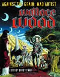
Truncated to become a Comics Journal cover, the image never made it onto the book. Instead, the cover that was used on Against the Grain was created by Roger Hill and John Morrow without my knowledge and never seen by me in advance. If they had shown it to me, I would have argued against it, because it may be one of the weakest covers Wood ever did in terms of action and storytelling. There is no anticipation. Spacemen have landed. So what?
Labels: against the grain, ec, wood
Comments:
<< Home
I remember asking Groth in 1988 at San Diego (in those long ago pre-Web days) whatever happened to the announced Focus on Wood book and he told me to keep watching the skies.
I wondered about that "typography" with the horrible computer effects. Glad to hear you had nothing to do with it! Your sketch looks much more appealing. Like an actual designer did it...
If one writes a title, as in Against the Grain: Mad Artist Wallace Wood, the colon separates the title from the subtitle. But in a book cover design, there should be no colon. Why is it there? I don't know.
Wood was remarkable. Marie Severin's coloring even enhanced his work; with some artists, Severin seemed to have an affinity for what they had accomplished, so her work remained very tasteful.
Off-subject: I was trying to post a response to that Steranko piece, but kept getting error messages; no such problem posting here, though.
Sorry, but the cover that was used on "Against the Grain" is a lot better design than the other attempt. The focal point is much clearer, the type treatment is nicer and more sophisticated. The original concept is all over the place. Why does Wood's name appears 3 times?!!? The weight of the type is wrong along with the positioning. The images on the side appear random and chaotic. I know this is a blow, but really, the one that was published is a lot more tasteful and aesthically pleasing.
Post a Comment
<< Home


